
How to Create Actionable Direct Mail Artwork
Graphic design plays a crucial role in the success of your business. Whether you like it or not, your business will be judged on its appearance! Discover how to create incredibly effective direct mail artwork that encompasses vital marketing principles, dramatically enhancing the returns on all your marketing.
Make Your Direct Mail Artwork Relevant
Direct Mail artwork is a very personal marketing approach. As such, your artwork must be unique to your audience. People respond to marketing when they feel it is specifically addressed to them.
Therefore, the use of imagery, headline, content and call to action must be specific to that recipient. Meaning, if you're sending a letter, address it to them and have their name on the letter. If it's location-specific, note that too.
For example, if you sell stairlifts in Leeds, the data you purchase should fit the demographic that will likely benefit from this. The message should then identify their potential issue and present your business as the obvious solution:
"Dear Mrs Jones...Is the pain of climbing the stairs each day becoming too much for you?
But does the thought of a beautiful stairlift sound out of your budget?
Here at (your company name) we now provide stairlifts from just (price) per month, interest-free, with complimentary hassle-free installation.
We would love to help you make your family home perfect for you again.
Call us today on (number) for a friendly chat with myself (put name and job title down, and maybe a photo too)..."
The remainder of this page covers elements to make your marketing relevant to your receiver, which in turn, dramatically impacts your return on investment.
Your Artwork Must Stand Out
Picture the scene. You've popped into the local coffee shop for your morning caffeine fix. You shuffle along the counter to grab some sugar but, just as you reach for the stirrer, something catches your eye. You're busy, you're on your way to work (heck, you haven't had that shot of caffeine yet), but still, something made you stop and take a second look.
It most likely was a visual element that made you do it. You might not have been able to read any text from that distance, but the colours, the shapes, the illustration or maybe the typography still drew you in.
If you want your flyer to serve its purpose, it needs to be seen. It's a visual advertisement, whether it's selling something or not. Read on to discover how you can make sure your marketing stands out.
Direct Mail Artwork Needs Clear Focal Points
There should be an element that draws viewers into the design. Whether that's an image or graphic, a headline, a promotion or even a particular font, your focal point is going to be crucial. And if you can, create a focal point that directs viewers to the essential info you're communicating.
Take a look at the example below. The flyer has two focal points: an eye-catching border and a succinct headline in an attractive font.
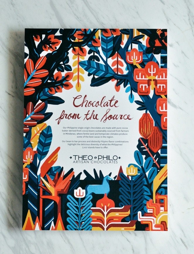 (Theo Philo, Artisan Chocolates – Direct Mail Marketing Campaign)
The border draws the eye to the centre of the layout, where the message behind the design is explained. The contrast between the darker colours of the border and the white background helps viewers to zero in on the copy.
In this second example, the focal point is pronounced. The yellow stripe highlights the essential points on the flyer (the business name, web address and the key message). Against the charcoal background, the yellow is very effective in showing viewers where they should be looking.
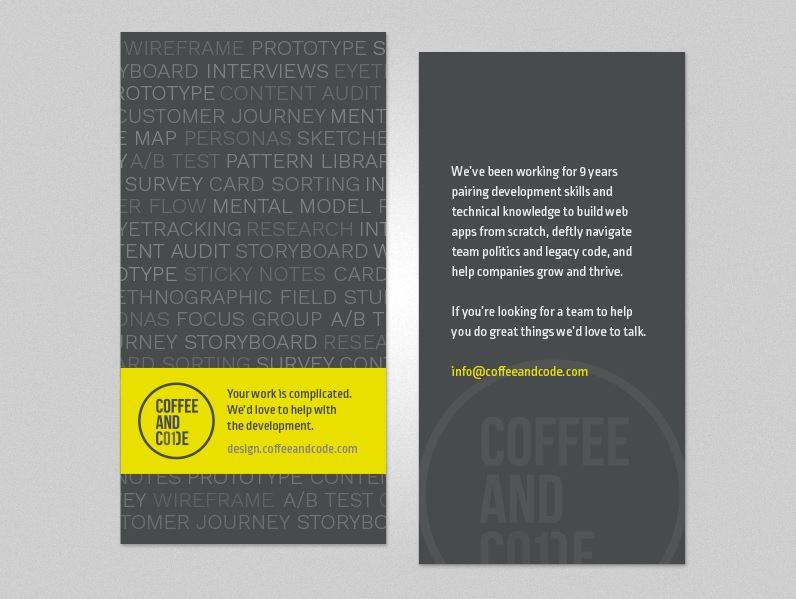 (Coffee and Code – Direct Mail Marketing Campaign)
Use Appropriate Images
The next important thing to think about is the imagery. They must be relevant. It doesn't matter if it's a simple graphic, like shapes or icons, or a photograph in the background (or, if you're fancy, a custom illustration or hand-drawn typography).
A visual component that's relevant to the purpose or theme of your flyer will help viewers understand what this thing is all about. For example, this series of leaflets for a university sports team uses photography well.
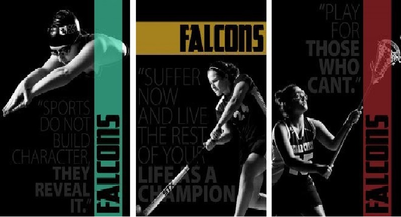 (Falcon – Direct Mail Marketing Campaign)
The combination of monochrome and such dramatic lighting puts the student-athletes under the spotlight and draws the eye straight to them. Paired with the bright colour, the imagery becomes even more striking and equally relevant. What better way to promote university sports?
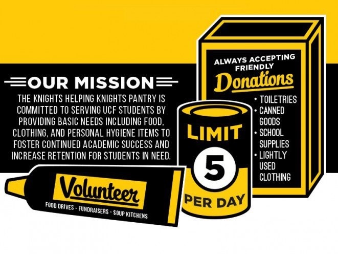 (The Knights helping Knights – Direct Mail Marketing Campaign)
This direct mail campaign is for donation and volunteering opportunities for a non-profit organisation. The flyer uses illustrations to incorporate crucial information with a pointer to the types of donation items needed. The black and yellow is pretty eye-catching too.
Create Compelling Copy
By this point, you may have crafted some cracking copy that you're excited to put out to your punters. But there's more to the flyer (or other printed direct mail items) than just the words.
The look of the thing has to make people want to read those words, or you may as well have sent a blank postcard. And you know what always works well? Bullet points. Here's why:
- The flyer will look better
- Your copy will read better
- The reader will find it easier to understand your message
The quicker you can grab your prospect's attention and make your point, the better. People scan information first, then go back and read through it thoroughly, providing the scanning phase has convinced them it's worth their time to do so.
As you can imagine, bullet points can come in handy for those purposes. So here are some pointers on using them to shape your text:
- Keep the bullet points short
- Use them to summarise your most important benefits
- Only communicate one idea per bullet point
- Keep your bullet points to fairly consistent lengths
- Forget sub-bullets; they're too confusing!
- Don't use more than five bullet points (err, oops)
The Power of Typography
Another fail-safe way to make your direct mail stand out is to use typography. And choosing the right font will take just as much care and consideration as picking the images.
Fonts have a real knack for giving a design a distinct look or mood, so you'll want to think about your flyer's purpose, context, and audience and find a font that matches up with its style and intent.
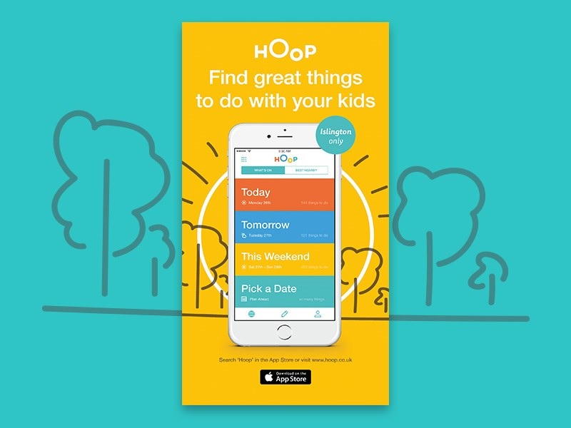 (HOoP – Direct Mail Marketing Campaign)
This flyer uses a simple, friendly sans-serif typeface to advertise an app for parents of young children. The simplicity hints at how easy it'll be to use the app and appeals to its audience of parents who, let's face it, probably don't have all that much time to spend reading oodles of information.
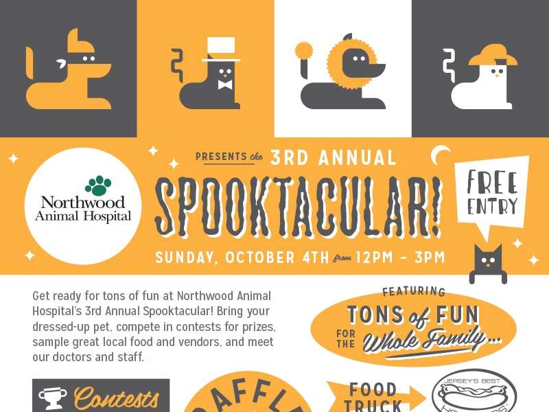 (Northwood Animal Hospital – Direct Mail Marketing Campaign)
This next one uses typography to pick up on the theme of the flyer's content: a Halloween event. While the illustrations cleverly point to the type of business that's hosting the event, the "spooky" typography alludes to the seasonal aspect and brings out the purpose of the design as a whole.
Don't go too far with the whole theme thing, though. Again, readability is crucial, so avoid any fonts that are a bit too ornate.
Communicate With Colours
Another thing to think about when you're designing your direct mail artwork is the colours you use. Of course, colour can be used to grab attention and draw viewers to focal points, but they can do a whole lot more than that too. Colour engages people's feelings and emotions, so how will you use it to enhance your flyer's message?
Warm colours like red and orange are thought to communicate warmth, energy and excitement. Cooler colours like blue and green are supposedly more calming, nature-inspired and conservative.
For example, this advert uses a calming ocean blue to complement its tips for keeping New Zealand's coastlines clean.
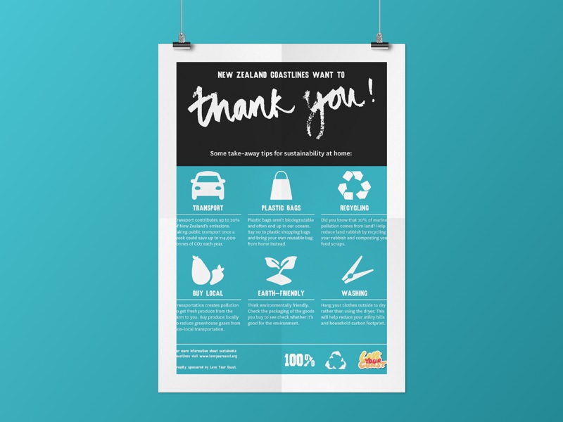 (New Zealand Coastlines – Direct Mail Marketing Campaign)
Colour choices don't always have to be quite so literal, though. In this example, a more abstract approach works too.
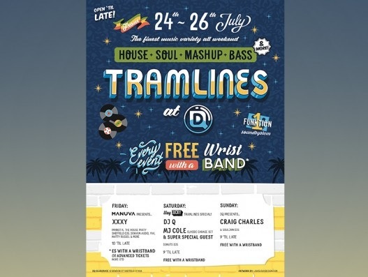 (Event Marketing Campaign)
The classic blue, white and yellow scheme lends a little seriousness to an otherwise whimsical design. The night-time background colour hints at the late-night festivities being advertised too.
Busy Artwork is Bad
When it comes to the overall design, one thing to steer clear of is a crowded layout. Cram too much info onto your flyer, and you'll confuse your message and put people off bothering to work out what you're advertising.
On the other hand, a balanced, well-spaced layout will make the pertinent information easier to find and the whole thing more attractive. Creating a perfect balance is about more than limiting your copy, though. It's about accepting the importance of white space too.
So ignore the temptation to use up areas without words or graphics to cram more in and let the white space be. Use the margins and alignment tools in your chosen design program to help you make a content-heavy flyer look more balanced.
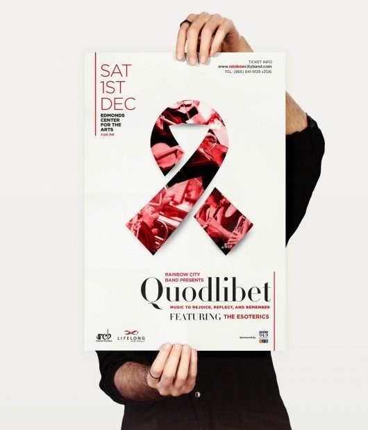 (Quadlibet Concert – Direct Mail Marketing Campaign)
Take this concert flyer, for example. You'll notice white space and strategic text alignment that separate and organise the content. The result is a balanced layout that creates a dynamic, diagonal composition that leads the eye from one element to the next.
Demonstrate Credibility
In business, credibility is hugely important. If you're approaching new customers or your company is relatively new, it's crucial to outline some credentials to give your readers a reason to trust you. Here are two easy ways to do just that.
- Use testimonials. One or two impressive testimonials that reference the benefits of your offering can have a tangible impact on the buying decision. If you don't have any testimonials yet, contact some customers and ask them to help you out (for a reward if necessary).
- Show accreditations and awards. Accreditations or accomplishments help to create trust by association. Have you won an award? Had positive press coverage? Are you a member of a relevant group or authority? Flaunt it!
It's Prudent to Proofread
Once you've written and rewritten until you're sure your flyer is word-perfect, please – proofread it. Even better, ask someone else to do it too.
Then, run it through Grammarly (a free online grammar checking site) as this points out typos and silly grammatical mistakes, which will chip away at your credibility as a company and will give your prospects a reason to distrust you.
These elements will help you in understanding how to create actionable direct mail artwork. Our Graphic Design Team are here to help you get the most from your marketing, and everything they design for you considers each of the elements discussed.
As a result, we can help you create and fulfil business building direct mail artwork simpler, faster and cheaper. Of course, everything we design for you, we also print and post.
If you'd like any more information about anything we've mentioned, or you'd like to discuss artwork of your own, please contact us today.


